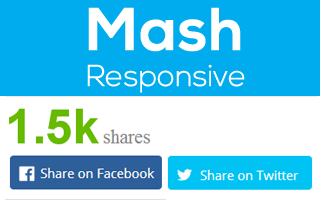
Responsive and beautiful style for using on mobile devices
MashShare already comes with a basic set of responsive buttons but sometimes you need to customize the responsive behavior. This is were the responsive add-on gives you a few more options of customization.
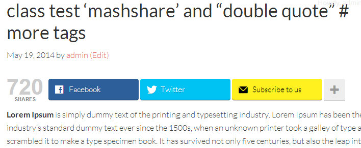
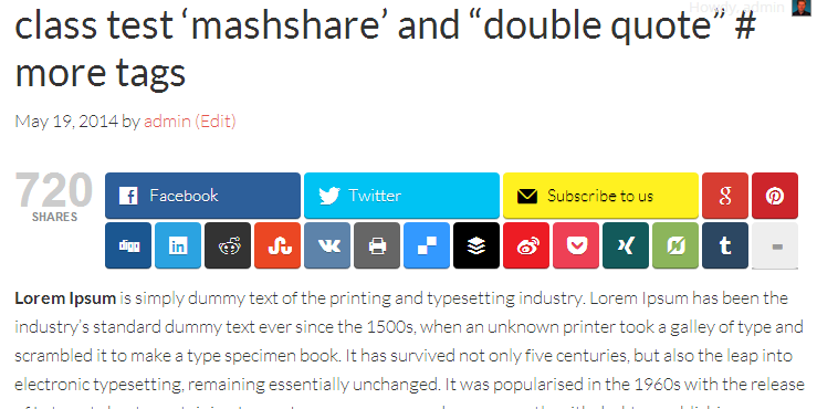
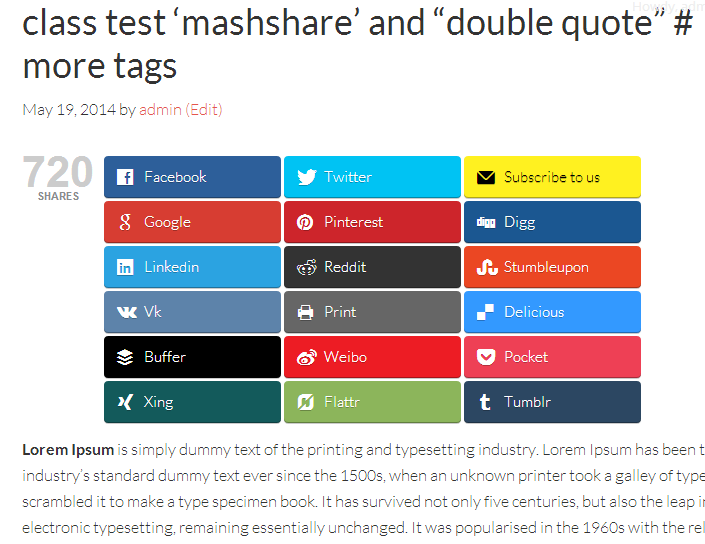
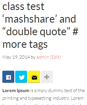
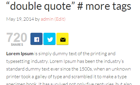
On smaller devices where place is rare the width of the buttons will be decreased automatically so that the large share buttons fit in one line instead below each other. With the new responsive Add-On you can specify the size of the Buttons on mobile devices and you can also determine if the text label (Share it on Facebook) is shown or not.
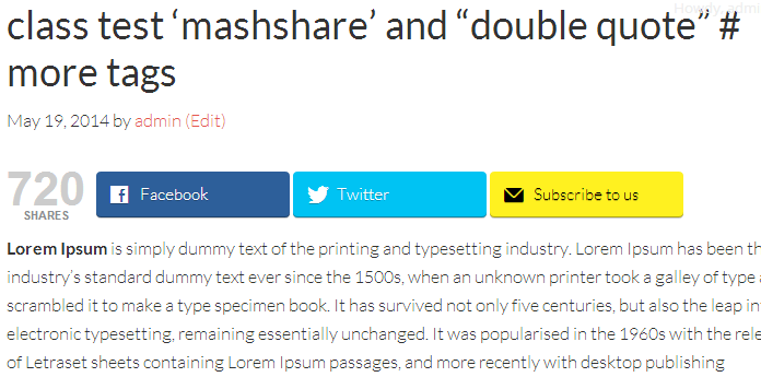
See the different variants on this page.
The buttons appearance change when they are shown on mobile devices:
Features:
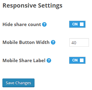
- Removes text description of the sharing button on mobile devices and scales down the large share buttons to small ones
- Decide to hide or show the show count on mobile devices via admin setting
Settings:
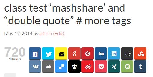
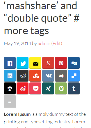
Different variants –
depending on screen resolution:

Your purchase contains:
- Updates and Support
- 1 Year Automatic Updates
- 1 Year Email Support
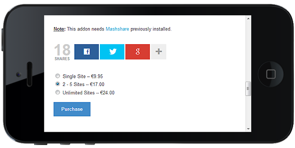
Note: This Add-On needs Mashshare previously installed.